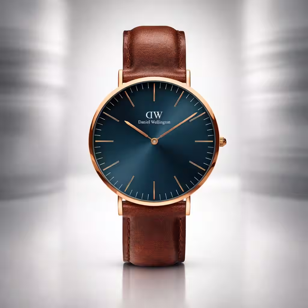
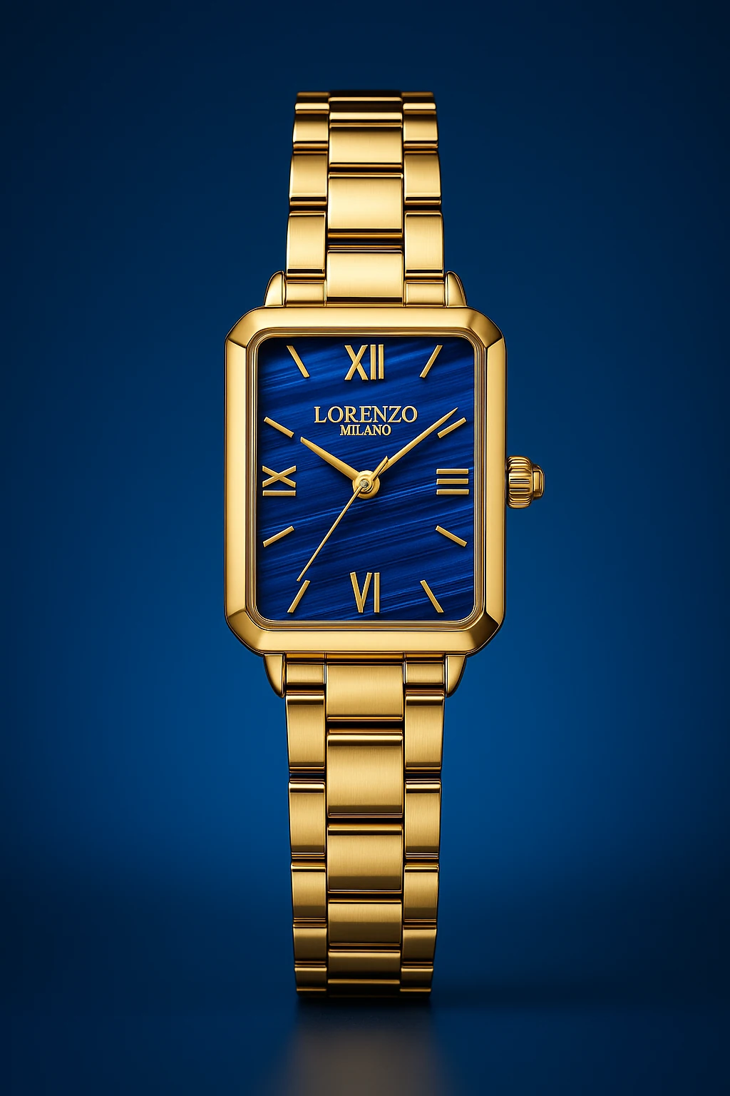
Use the uploaded image of the watch exactly as it is — do not change or stylize any part of the watch, including its model, shape, dial, logo, color, strap, or numbers. All details must remain 100% untouched and clearly visible, especially the text, indices, and logo.
Position the watch exactly like a luxury product ad: standing upright, front-facing, and perfectly centered in the frame, just like the reference image.
Create a clean, premium gradient background that softly glows from behind the watch. The background color must match and complement the main color tone of the watch dial (e.g., if the dial is blue, use a deep blue gradient that fades from the center outward).
Lighting should be super soft and natural, creating elegant reflections and subtle shadows to enhance realism, texture, and depth. Emphasize the quality of the materials without adding artificial effects.
Apply shallow depth of field so the background remains slightly blurred while the watch is perfectly sharp, detailed, and photo-realistic.
🖼️ Format: Vertical (9:16 or 2:3)
🎯 Style: Minimalist, editorial, premium
✅ Perfect for luxury advertising, magazine spreads, or product catalogues
⛔ Do not add text, environment, or props — the focus must remain solely on the watch

.avif)
.avif)